back

case study

UniLink: mentorship for exchange students

Peer mentorship app for the first 30 days abroad — research, system, and prototype in 4 weeks.

#mobile#community#ui#interaction#uxresearch

UniLink: mentorship for exchange students cover

Talk to a local first. Studying abroad should feel like an adventure — not figuring out how to turn off a fire alarm alone.

Overview

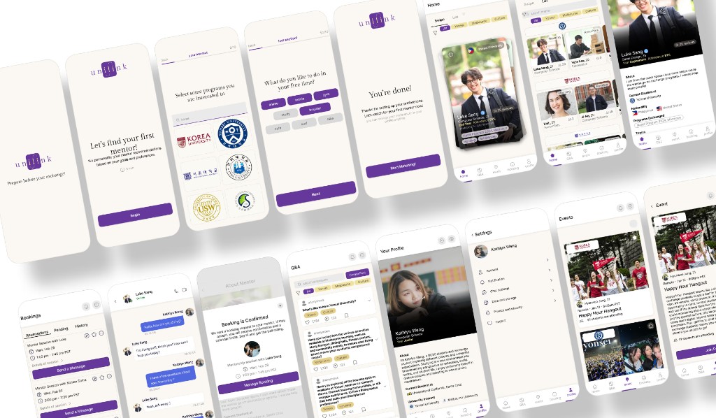
UniLink is a mentorship platform that connects incoming exchange students with peer mentors at their future university — for academics, culture, and the messy first 30 days abroad.

I owned visual design, the design system, interaction design, and prototyping on a three-person team over four weeks.

role
Visual design, design system, interaction design, prototyping
team
Ruhin Gharai (PM), Brian Camilo (research), me (visual)
timeline
4 weeks
methods
Community survey (60+), 4 interviews, competitive analysis, heuristic walkthroughs with 8 students
tools
Figma, FigJam, Google Forms
UniLink overview: phone collage of app screens with Situation, Task, Action, and Results
Temp archive — original overview layout

The problem

  • Isolation in a new system. 1M+ exchange students each year land without familiar support for culture, logistics, and daily life.
  • Scattered help. Information lives across university sites, group chats, and random forums.
  • People want people. Nearly 4 in 10 said they'd rather just talk to someone.

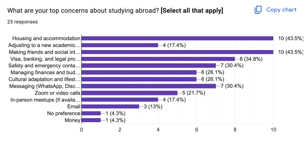
Here are the biggest complaints from a one-week community survey (60+ responses), then 4 interviews and a competitive scan:

1/

Information is scattered across multiple platforms

2/

Difficulty navigating logistics in a foreign environment

3/

39% of global students would prefer to just talk to someone

Problem section with How Might We prompt and three research insight cards with charts
Temp archive — problem + insight cards

Discovery

Not more resources, tools, or systems. The best way to show the how is talking to a human.

We scoped to exchange students (not all housing searchers), then cut features hard for a four-week build.

FeatureKeep?Why
Q&A forumYesFamiliar (Piazza/Quora); real human answers
Community eventsYesOnline → real-life involvement
Video callYesSafer after matching
AI chatbotNoHallucination risk; shifts away from peer help
Financial proofNoFintech scope creep
Housing matchNoUniversity's job
Emergency contactNoCrowded; not our edge

Mentorship over housing search

Research widened the problem past housing. Narrowing to exchange students let us build a mentorship platform that matched what people actually asked for.

why

Housing is a university's job. Mentorship — talking to someone who's been there — was the gap competitors weren't filling well online.

impact

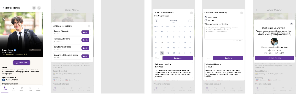
A tighter product: match, book, ask, and meet — instead of a half-built housing marketplace.

gave up our first idea — roommate / housing match

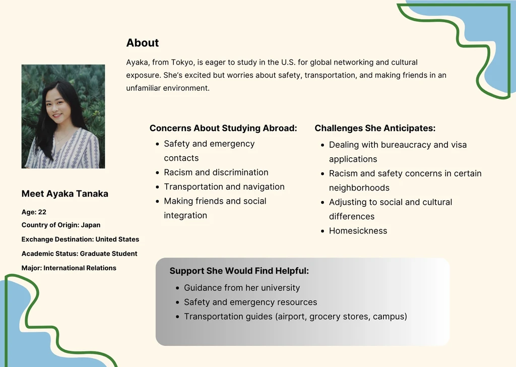
Discovery: insight callout, personas, feature prioritization table, and low-fi wireframes
Temp archive — discovery + wireframes

Design

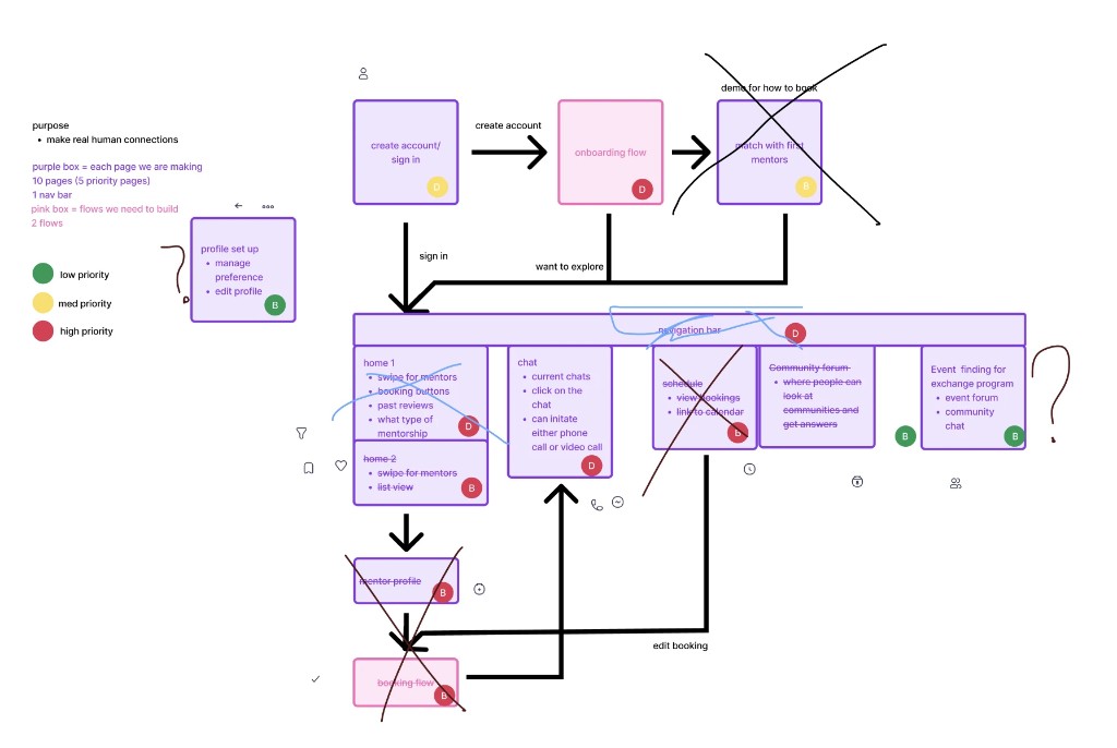
I mapped information architecture with the team so we knew how many screens we needed, then iterated hi-fis in the open so hierarchy read from across the room.

Design section: moodboard, information architecture, flow sketches, and deep-dive accordion entries
Temp archive — IA and craft deep-dives

Open a craft thread when you want the detail — keep the main scroll light:

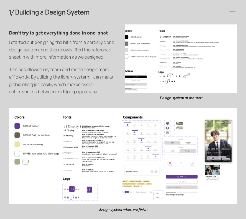
1/ Building a design system

Don't try to finish the system in one shot. We started partial and filled tokens and components as screens landed — then the library kept the product cohesive.

UniLink design system: colors, type, logos, nav icons, pills, buttons, and mentor profile cards
System at the end — tokens + components
2/ Animating a logo

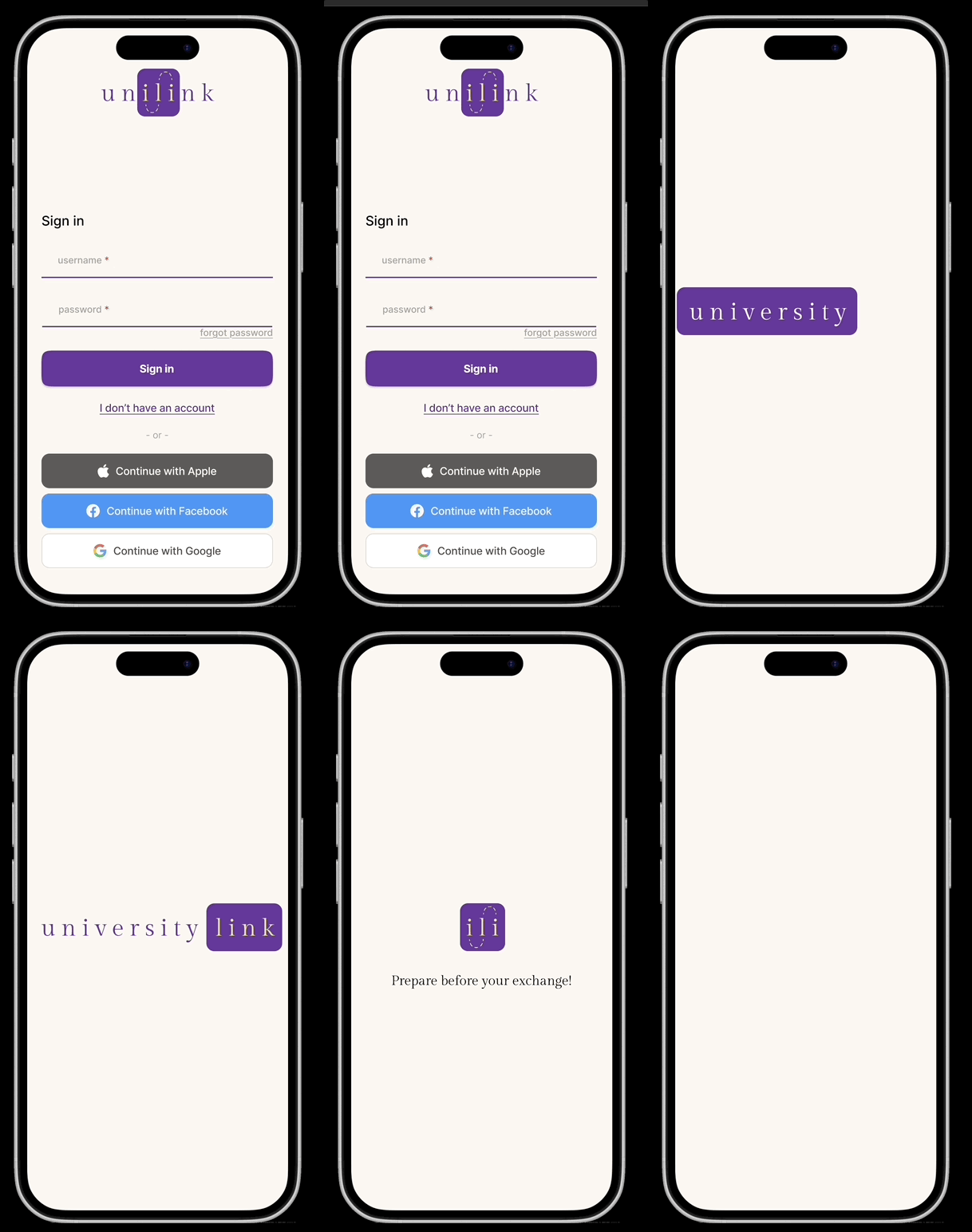
Early mono wordmarks read like buttons. We moved to a connected wordmark and a 3–5s intro (dot → line → “university link” → icon) so the brand landed before the first screen.

Logo sketches, wordmark iterations, login screens, and Smart Animate intro frames
Ideation → Smart Animate intro
3/ Iterating on the navigation bar

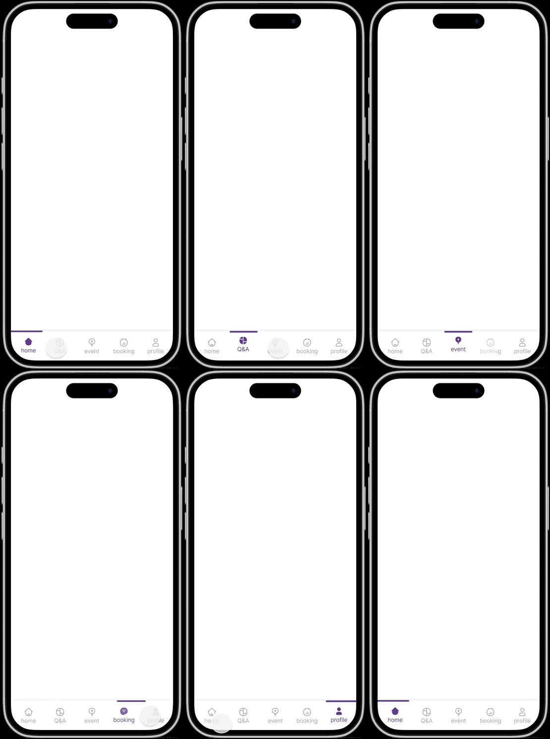
The tab bar is on every screen. Color-block active states were clear but loud — we switched to a top indicator line + purple active icon so the page stays primary.

Navigation bar rationale and iterations from color-block to indicator-line active state
From color block → indicator line
Six navigation bar accessibility variants covering color-blindness, visual cues, contrast, and feedback
Accessibility variants

Test with users

I led heuristic walkthroughs with 8 global students — hunting logic fails, then revising.

1/ Confusing Q&A layout

The Q&A page design can be better, and I think instead of filter maybe sorting to pick category questions would be easier

exchange student 1
Issue
Q&A flow wasn't intuitive — too many steps before finding answers.
Why
Filter-heavy layout asked for work before value.
Fix
Restructured toward a Reddit-like feed: clearer posts, sortable categories, Create Post up front.
Before and after Q&A page redesign on mobile
Before → after Q&A layout

2/ Booking icon is hidden

The booking symbol for scheduling was hard to find and I would rather have it on the navigation bar as I would check it out often

exchange student 2
Issue
Booking was hard to find.
Why
Top-bar icons read as secondary; outside the thumb's normal path.
Fix
Moved bookings into the bottom nav — where people already check often.
Booking icon moved from top bar to bottom navigation
Top bar → bottom nav

3/ Saving an event

I want to be able to save events I want to go maybe so I can apply closer to the date once I know my schedule better

exchange student 3
Issue
Users wanted to save events for later.
Why
They expected more actions on cards — not just view and go.
Fix
Reused the mentor-card star component on event cards for a quick save.
Event card with star save control called out
Star save on event cards

Refine

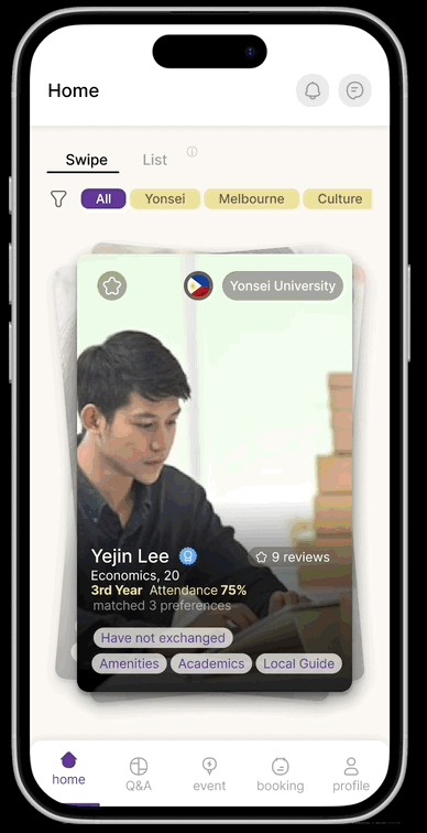
I led mid-fi → hi-fi by making ratings, availability, and primary actions glanceable — not just polishing chrome.

Usability findings accordion, booking before/after, and onboarding flow screen grid
Temp archive — test + onboarding evolution

Impact

Lessons

  • First idea ≠ right idea. Housing felt obvious; exchange mentorship was what people needed.
  • Cut is a design skill. Saying no to chatbot / housing / emergency kept the four-week build shippable.
  • Thumb zone is real. Booking only worked once it left the top bar.

Next: design for mentors — what makes them show up and stay.

Conclusion with reflections, next steps, acknowledgements, and project footer
Temp archive — conclusion