

BridgeUs: Viewing Responses
Redesigning the page to view responses from a guided activity
Project Type
Tech4Good Lab, Education, Website
My Roles
UI Design, Website Audit, Redesign
Duration
September 2023 - March 2024
(6 months)
Team
Lilian Tang (Design Lead)
Brent Chou (UX Researcher)
Nathan Dolor (UI Designer)
Me (UI Designer)
We are Redesigning BridgeUS
BridgeUs is an education platform with guided activities to bridge parent and student conversations about future career choices. Our platform's goal is to help people open their minds, engage with diverse perspectives, and rethink their assumptions after guided reading activities.
My Role
Out of the 4 designers on our team, each of us is responsible for redesigning 1 page of our guided activity. Over the course of four weeks, we ran scrums to make sure we were each iterating our page on the same design goal and our user flow checked out.
The Problem


Before
After
Finding our needs through wireframing
My team brainstormed several wireframe sketches for the Community Responses page. We had a general idea of how the page should look. I narrowed our ideas into 3 wireframes. I grouped our ideas based on how users can engage with responses: by action, discussion, or visuals.
Option 1: Actionable Cards
Have cards that encourage users to actively click on each response, associating what users read with an action.
Action Wireframe

Action Lo-Fi
❌ Actions are for Building Muscle Memory
The actionable cards that link clicks to responses help with memorization. However, our goal isn't to make users remember the responses of other participants.
Option 2: Discussion Thread
Have text boxes to reply to other people's responses, creating discussion threads.

Discussion Wireframe

Discussion Lo-fi
❌ Opening too Big of a Conversation
The Discussion Thread is great for expanding the discussion. However, we don't want users challenging each other's views for this activity, nor do people like being required to write a reply. This response page should be about exploring different viewpoints and understanding the general idea better.
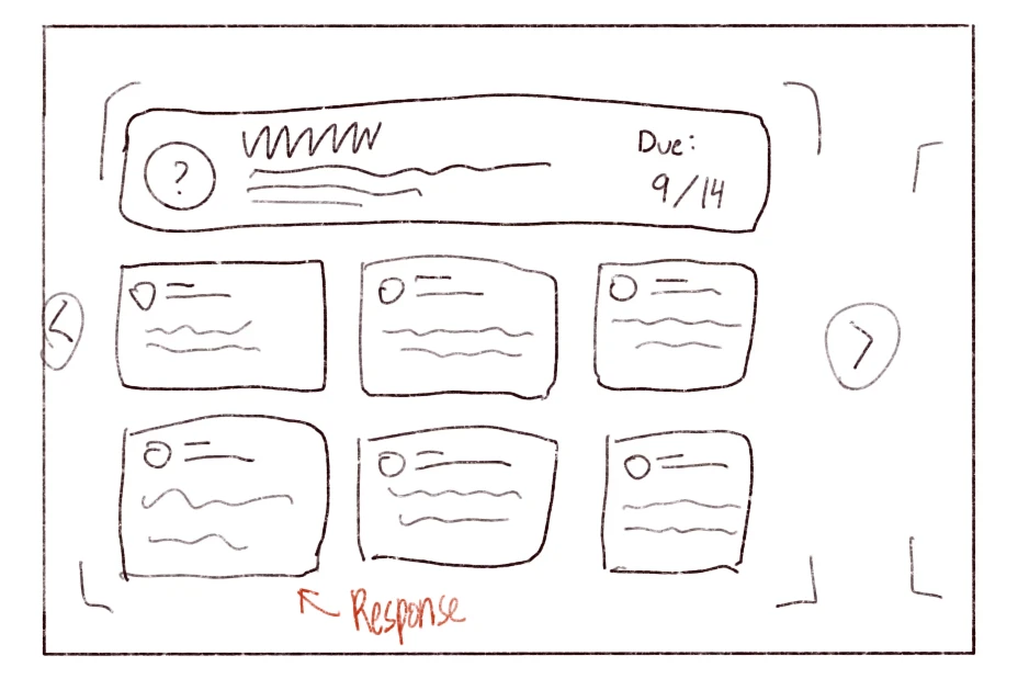
Option 3: Visualization of Responses
Visualized graphs and charts of the collected responses, allowing user to draw quick conclusions and grasp general metrics.

Visual Wireframe

Visual Lo-fi
✅ Visualization = Getting the Big Picture
A visual approach makes it easier to connect ideas. It invites people to reflect, think, and start conversations with critical thinkingr.
All 3 designs are good designs and serves their purpose. However, some of the purpose are not the experience that we want the users to have.
After looking through our low-fidelity options, my team made a decision. We’re going with a visual-based UI for the response page. It fits right in with our platform’s goal— fostering critical thinking.
Chosen Low Fidelity Prototype
After picking out the direction, I studied the current design to figure out which parts are working, and which ones needed better clarity.


Areas in the original design that could use better clarity
Prompt Box looks like Ignorable Label
The prompt box contained two questions, which made it hard to read. The colored background made it easy to ignore, resembling a generic warning pop-up.

I expanded the prompt box to a question card and placed the text on a white background, as well as add in some visual hierarchy. This makes it easier to read and harder to overlook. Users can now focus on the questions without distractions.

Distracting Progress Bar
The progress bar felt out of place, sitting alone in the corner. It looked separate from the rest of the page and didn’t relate to the content users were viewing.

Remove distractions. By taking out other elements in the same section, it feels like it belongs in it's own space (without needing to change the existing component that's used on other pages)

What are those Circles?
The circles were meant to categorize responses by emotion, but without labels, their meaning was unclear. Users couldn’t tell what the colors represented.

I took out the circles as we are not using those components anymore, and replaced them with a bar graph of the responded emotions, visualizing of the responses. Now, users can quickly understand what emotions are reflected.

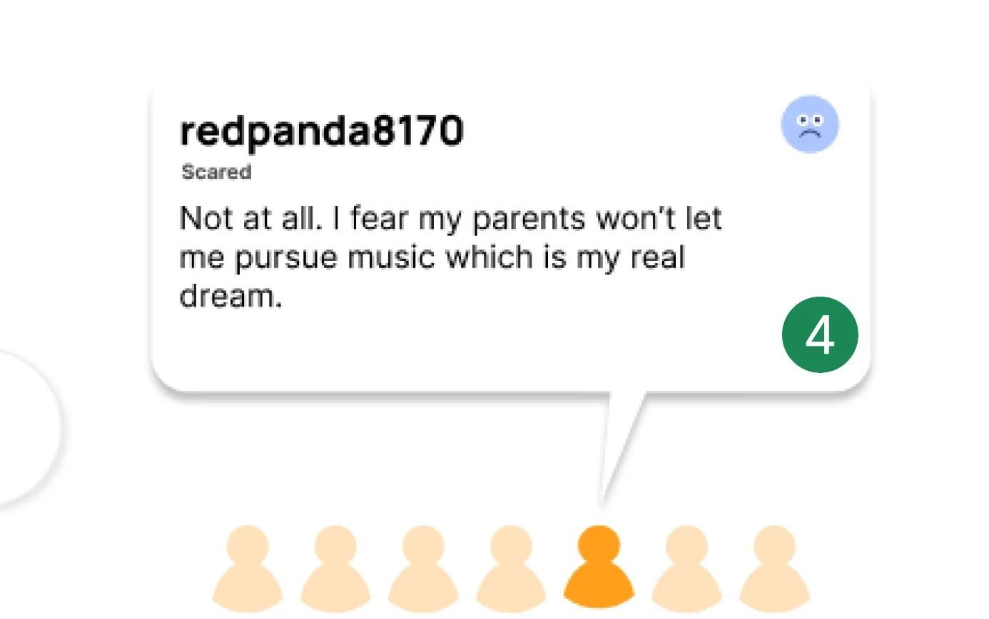
Who's Talking?
Responses lacked a clear connection to the people who submitted them. Without profile pictures or names, it was hard to tell who was saying what.

I used person icon for each response hover, as well as a vectorized triangle to make the response resemble a speech bubble. This makes it easier to see who’s contributing and creates a more personal connection.
Out of Bound
The response section, located at the top left of the page, feels like an entirely different actionable area. It didn’t visually connect to the fulfillment process, making it seem unrelated.

I moved the response grouping selection to be in the same section as the responses, letting users able to navigate between different response pool without having to move mouse far.

Putting Together a High-Fidelity
By strategic grouping of the interactable elements to be in the same card and around the same area, I provide better clarity on what space is usable, without making big changes to the original components.
Another round of iterations
Comments from stakeholder
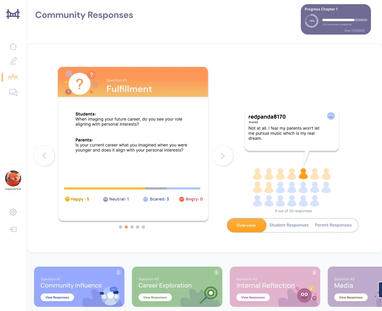
"This design organizes responses by themes really well. It’s flexible in how many themes and responses we can show. Users should easily see which themes stand out more, maybe through text size, color, or charts."
"The progress bar isn’t adding much value. Let’s take it out. This design works best for showing multiple responses in a clean and structured way."
"The chapter component needs to be clearer across pages. Right now, it’s not reading well. Also, let’s remove the emotion bar since most responses are positive, so it’s not a useful metric."
We’re happy with the visual direction so far. I made a few key changes to improve usability and address the feedback:
Matched the chapter’s color with the main interactive card for a more cohesive look
Chapters are now in clickable tabs for easier navigation
Removed the progress bar and the emotion bar, keeping things cleaner
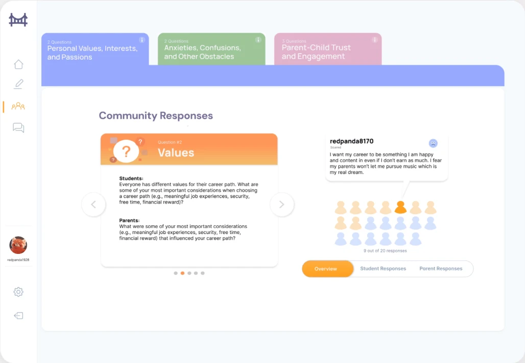
Final Design

Navigating the final design
Reflections
I learned from this project that just because something looks good doesn’t mean it serves the function. Usability has to come first. Sometimes a design just didn’t fit what we needed, and good design is about problem-solving, not just making things look nice.
Results
We re-designed UI elements by organizing them by function and emphasizing certain visual elements for enhanced visibility. Focusing on a visual-based UI helps our team’s goal of engaging insightful discussions between students and parents. As a result, users were able to pass our 3 user tasks 50% faster, with no hesitation or delay.
Things I'll Change
Looking back, I would have collaborated with the research team to conduct a more throughout usability analysis and have quantifiable metrics to justify design choice. But for now, the page does what it's supposed to do, and that’s what really counts.